Yepic · Mobile product · UK startup
Designing a mobile product under uncertainty
Auditing and redesigning a tradespeople app while navigating limited access to users, complex automation rules and an evolving business model.
Project overview
From a single-user tool towards collaboration and paid services
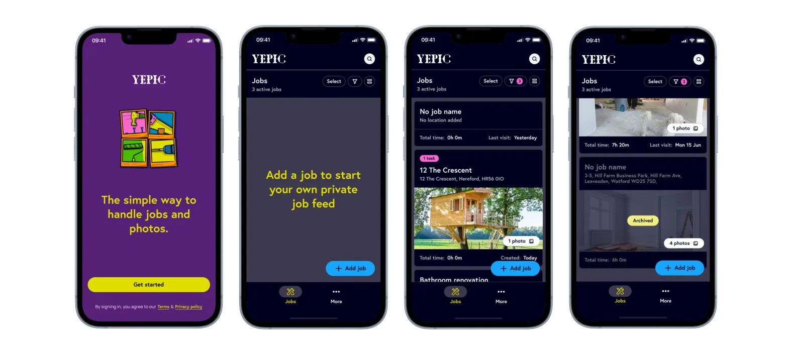
Yepic was a free mobile app that helped tradespeople document jobs through photos, location and time tracking. I joined the project after its initial release to audit the experience, redesign its core journeys and support its evolution.
The starting point
A useful idea without a coherent product experience
The initial product used photos and their metadata to record where and when work took place. The idea had potential, but the first version did not yet support a clear end-to-end experience.
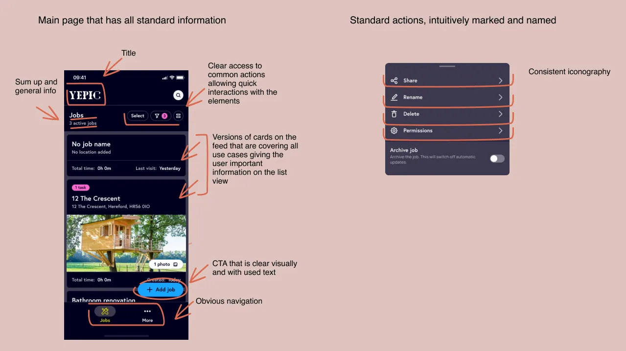
Our audit identified problems across navigation, terminology, functionality, visual consistency and system feedback. Individual screens existed, but they did not form a sufficiently clear journey.
Reframing the problem
From interface redesign to product-system analysis
The task began as an audit and visual redesign. It quickly became a broader product problem involving user behaviour, automation, permissions, collaboration and monetisation.
Direct user research was not approved, so we worked with the limited evidence available: product analytics, stakeholder knowledge, trade-fair recordings, feedback from tradespeople and examples of tools already used in their daily work.
This evidence was useful, but it could not replace direct validation. I treated the resulting assumptions as constraints to manage rather than confirmed user needs.
Core product challenge
Making automation understandable and controllable
The product could associate photos and time spent with a job by using location data and photo metadata. That value depended on permissions, complete data and the system’s ability to distinguish between jobs at similar locations.
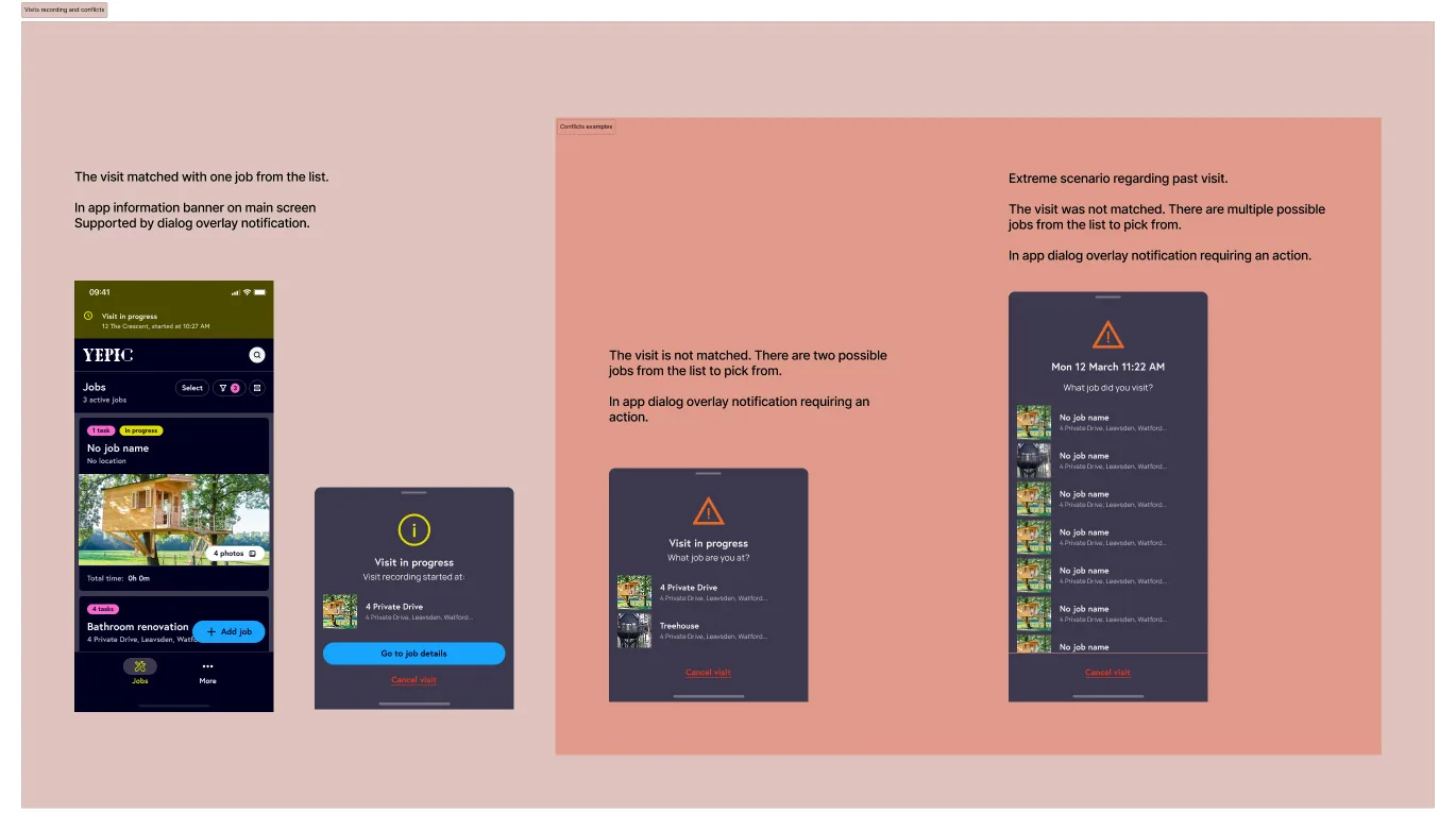
I helped translate these dependencies into user journeys and system states: onboarding and contextual permission requests, confirmation of recorded visits, conflict resolution when several jobs matched one location, and fallbacks for people who did not grant all permissions.
Redesign and delivery
Creating consistency while development continued
The redesign and implementation progressed in parallel. A reusable UI kit allowed the team to work directly in high-fidelity screens, while UX writing was coordinated to improve terminology and consistency.
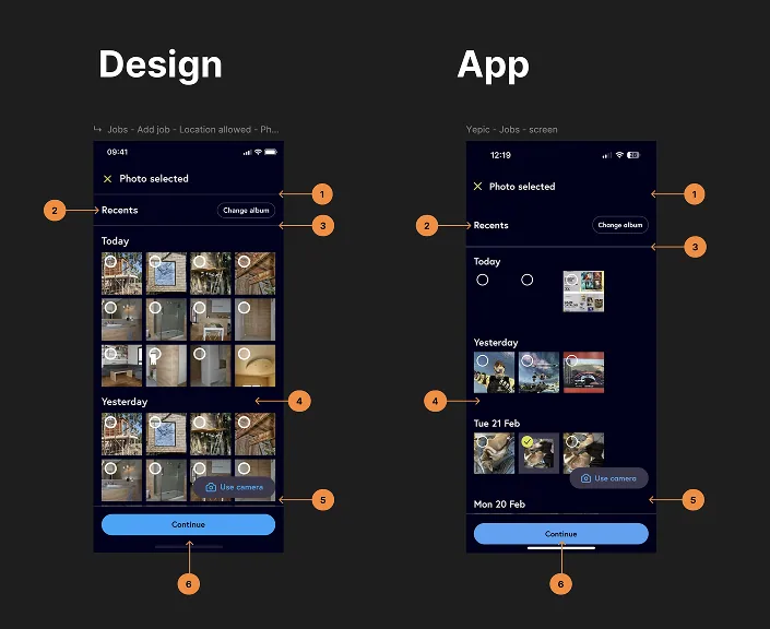
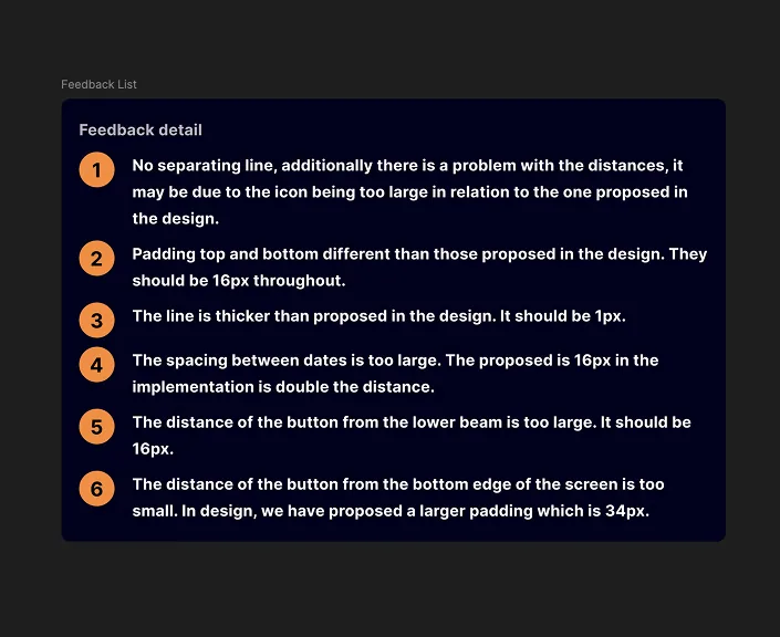
I restructured journeys, expanded edge cases, defined permission and notification behaviour, prepared interaction references and audited the test build for functional, interaction and visual discrepancies.
Workshop facilitation
Turning a broad collaboration idea into product questions
Supporting several people on one job affected roles, permissions, ownership, invitations, communication and the visibility of each person’s contribution.
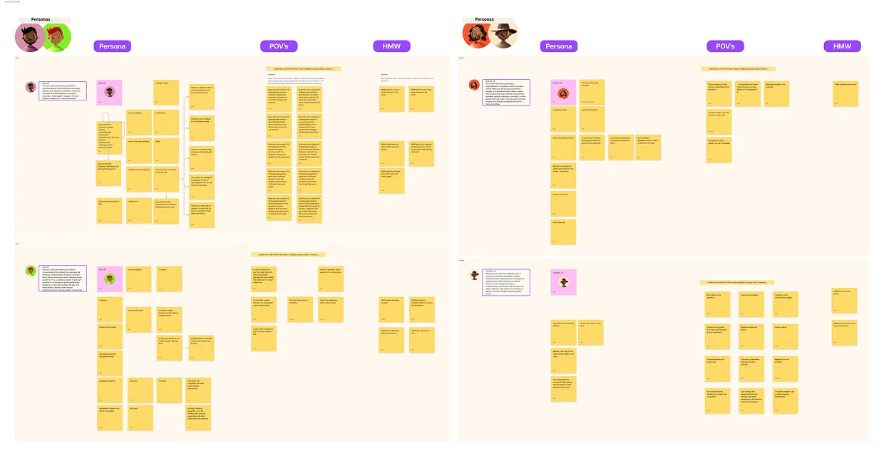
I helped facilitate workshops using provisional personas, points of view, How Might We questions, Crazy 8s and reference examples. The purpose was to expose dependencies before committing to screens.
Scaling the product
Designing collaboration, access and a paid tier as one system
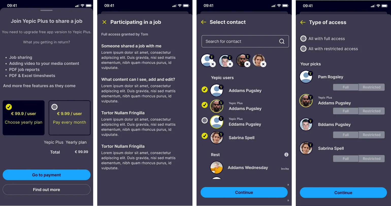
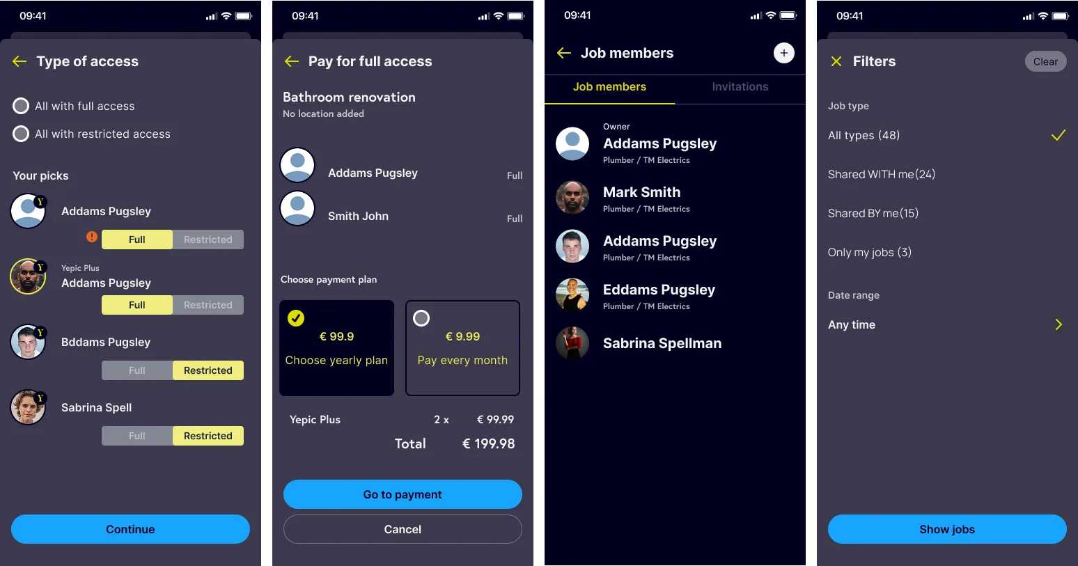
The next phase explored shared jobs and Yepic Plus. What appeared to be a sharing feature changed the product model across access levels, membership, job ownership, invitations and payment.
The resulting concepts covered shared jobs, full and restricted access, group membership, contact selection and paid access for additional participants.
Outcome
A redesigned product and a clearer model for its next stage
The core application was redesigned and released. The team also produced a structured view of the dependencies behind automated tracking, a backlog of implementation issues and concepts for collaboration and monetisation.
Not all recommendations were adopted. Direct user testing and the proposed post-release iteration were not commissioned, so I do not attribute validated adoption or business outcomes to the redesign.
Reflection
Product judgement includes making uncertainty visible
Yepic reinforced that a well-documented redesign cannot compensate for missing validation and iteration. When evidence is limited, the designer’s responsibility is to distinguish facts from assumptions, show the consequences of decisions and create a path for learning.